

If you’ve ever opened Canva, Photoshop, Figma, or Illustrator and stared at a blank page wondering where to begin, you’re not alone. It’s one of the most common challenges beginners face.
The truth is, great flyer design doesn’t start inside a design application. It starts with an idea.
Before we dive into the process, let’s quickly understand what a flyer is and why planning your ideas is one of the most important skills you can develop as a designer.
What Is a Flyer?
A flyer is a single-page marketing or promotional design used to communicate information quickly and encourage people to take action.
Businesses, churches, schools, event organizers, NGOs, startups, and individuals use flyers to promote events, advertise products or services, announce programs, share important information, or build awareness.
A good flyer answers a few simple questions almost immediately.
- What is this about?
- Why should I care?
- What should I do next?
If someone has to spend too much time figuring out the message, the flyer isn’t doing its job.
What Does It Mean to Ideate a Flyer Design?
The word ideate means to develop and explore ideas before creating the final solution.
In flyer design, ideation is the process of thinking through your design before you start building it.
This includes understanding the flyer’s purpose, identifying the target audience, organizing the content, deciding what should stand out, and creating a rough layout sketch.
Think of it as creating a game plan before the match begins.
Many beginners believe designing starts when they open their favourite software.
Professional designers know it starts much earlier.
The clearer your ideas are, the easier the design process becomes.
Your Design Tool Is Not the Most Important Thing
One mistake I see quite often is beginners asking,
“Should I design this in Canva?”
“Is Photoshop better?”
“Should I learn Figma instead?”
Here’s my answer.
It doesn’t matter!
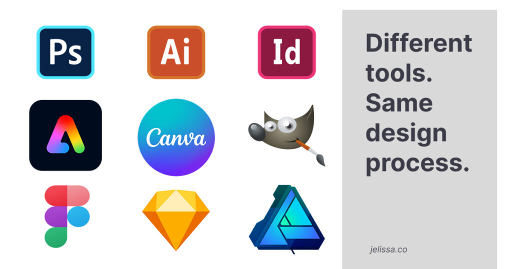
Whether you’re using Adobe Photoshop, Adobe Illustrator, Canva, Adobe Express, Figma, or another design application, the process is the same.
Every one of these tools allows you to create flyer designs.
What separates a beginner from a good designer isn’t the software they use. It’s their ability to think through a design problem before they begin designing.
If you understand layout, typography, spacing, colour, hierarchy, and composition, you can recreate the same flyer in almost any design software.
Software changes.
Design principles don’t.
Here’s a breakdown of the process you can follow when you get your next flyer design project:
Step 1: Understand the Goal
Before you sketch anything, ask yourself three simple questions.
- What is this flyer about?
- Who is it for?
- What should people do after seeing it?
Every flyer should have a clear objective. If you don’t understand the goal, you’ll find yourself making design decisions without any direction.
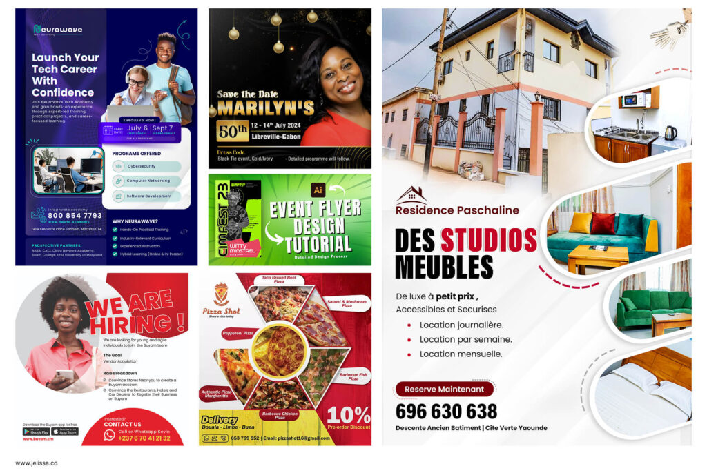
Let’s take the example of a new school, college, university, or tech academy.
The purpose of the flyer isn’t always the same.
Sometimes the goal is to encourage people to register for an upcoming intake or training programme.
Other times, the goal is simply to create awareness and introduce the school to the public.
It could also be to promote a specific course, announce an upcoming seminar or open day, advertise a scholarship opportunity, or invite people to an event.
Although these flyers may represent the same institution, each one communicates a different message and serves a different purpose.
Once you understand the goal, it becomes much easier to decide what information should stand out, what visuals to use, and what action you want the audience to take.
A flyer designed to drive registrations won’t necessarily look or communicate the same way as one designed to build awareness.
That’s why understanding the goal is always the first step in the design process.
Step 2: Gather the Content
Once you understand the goal, the next step is to gather all the information that needs to appear on the flyer.
In some cases, the client will provide everything you need in a design brief. Other times, you’ll need to ask questions to fill in the gaps.
Don’t be afraid to ask the client, project manager, stakeholder, team lead, or whoever has the information. Asking questions is part of the design process, not a sign that you don’t know what you’re doing.
For example, you might ask:
- What is the main headline?
- Is there a tagline?
- When and where is the event taking place?
- Is there a registration deadline?
- Who is the speaker or presenter?
- Which contact details should be included?
- Do you have a website or QR code?
- Are there any logos, brand colours, or images that must be used?
Once you’ve gathered everything, write it down before you start designing.
At this stage, don’t worry about where each piece of information will go.
You’re simply collecting all the pieces before putting the puzzle together.
Having all the content upfront also helps you identify what’s essential and what can be left out later if the design starts to feel crowded.
Step 3: Decide What People Should Notice First
This is called visual hierarchy, and it’s one of the most important principles in graphic design.
Not every piece of information deserves the same level of attention.
Ask yourself,
“What is the first thing someone should see?”
Usually, it’s the headline.
After that, think about what should come next.
Perhaps it’s the main image, followed by the event date, then the venue, and finally the call to action.
When your hierarchy is clear, your flyer becomes much easier to read.
Step 4: Look for Inspiration
Before you sketch your ideas, spend some time looking at designs created by other designers.
This is something professionals do all the time.
Looking for inspiration doesn’t make you less creative. It helps you explore different ideas, discover new approaches, and understand what works well.
You can find inspiration from places like:
- Behance
- Dribbble
- Design blogs
- Flyer templates
- Magazine layouts
- Posters and billboards
- Company websites
- Social media advertisements
Don’t limit yourself to flyers alone. Sometimes the best layout idea comes from a website, a poster, or even a magazine cover.
As you explore, pay attention to things like:
- How the information is arranged.
- The use of typography.
- Colour combinations.
- Image placement.
- Spacing and white space.
- Visual hierarchy.
- The overall mood and style.
Every professional designer gathers inspiration before creating something new.
Step 5: Sketch Your Layout
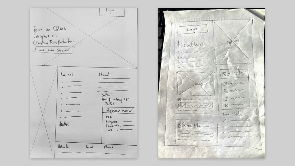
Now it’s time to put your ideas on paper.
Don’t worry if you can’t draw.
Your sketch can be nothing more than rectangles, circles, and simple lines.
The purpose of a sketch isn’t to create beautiful artwork.
It’s to organize your thinking.
You can decide where the headline goes, where the image sits, how the information flows, and where your call to action should be.
A simple sketch of 3-15 minutes can save you hours of unnecessary revisions later.
Remember, Your Sketch Is Not the Final Design
This is something I always tell my students.
Your sketch is a guide, not a contract.
Don’t feel like every single element has to appear exactly as you planned it.
Once you begin designing, you’ll naturally discover better ways to arrange the content.
You might decide to remove an icon because it adds clutter.
You may enlarge the image to create more impact.
Perhaps the headline looks stronger in the centre instead of the top left.
You might even remove an entire section because it doesn’t help communicate the message.
That’s perfectly normal.
In fact, it’s a sign that you’re thinking like a designer.
The sketch gives you direction, but your creativity shapes the final result.
In many cases, around 80 to 90 percent of your original sketch will remain, while the remaining changes come from refining the design based on balance, spacing, typography, imagery, and visual appeal.
A Few Things to Keep in Mind
As you practise this process, remember these simple principles.
- Your sketch is meant to guide you, not restrict you.
- Not every piece of information needs to appear on the final flyer.
- If an element doesn’t improve communication, consider removing it.
- Always design for your audience, not for yourself.
- Good design is about solving communication problems, not decorating a page.
- Focus on mastering design principles before worrying about mastering software.
These small mindset shifts will make a huge difference in the quality of your work.
What’s Next?
Now that you understand how to ideate a flyer design, it’s time to put the process into practice.
Watch my beginner-friendly YouTube tutorial, where I take one of these ideas and build a simple flyer from start to finish. You’ll see how the planning process translates into an actual design using professional design principles.
Final Thoughts
If there’s one thing I want you to take away from this article, it’s this.
- Don’t let software become your starting point.
- Start with the problem you’re trying to solve.
- Understand your audience.
- Organize your content.
- Sketch your ideas.
Then use whichever design tool you’re comfortable with to bring those ideas to life.
Remember, Photoshop doesn’t make someone a designer. Illustrator doesn’t make someone creative.
Canva doesn’t automatically produce great layouts. And Figma isn’t only for UI design.
Your greatest design tool will always be the way you think.
Master the process first, and you’ll be able to create great flyer designs in almost any software you choose.