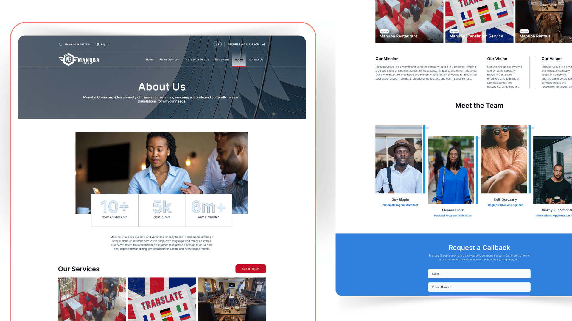
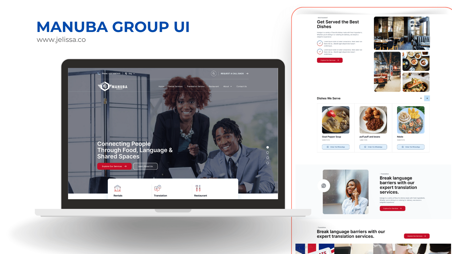
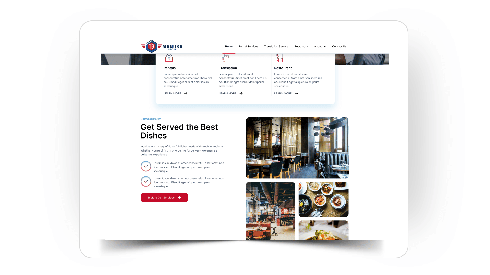
Manuba Group is a company based in Cameroon, offering a unique blend of services across the hospitality, language, and rental industries. With a mission to deliver excellence and customer satisfaction, they provide unforgettable dining experiences, professional translation services, and modern event space rentals.
The goal of this website UI project was to unify these diverse services under one clean, engaging, and user-friendly platform, while reflecting the vibrant energy of the brand.
Client
Manuba Group
Role
UI Designer
Deliverables
UI Design, Development
Status
Complete
Overview
Create a modern, cohesive brand identity that works across all services
Make it easy for users to navigate between Restaurant, Translation, and Rentals
Highlight WhatsApp as a primary CTA for orders, bookings, and inquiries
Use the company’s existing blue and red color palette, balanced with fresh accent colors for a lively and professional feel
Key Features
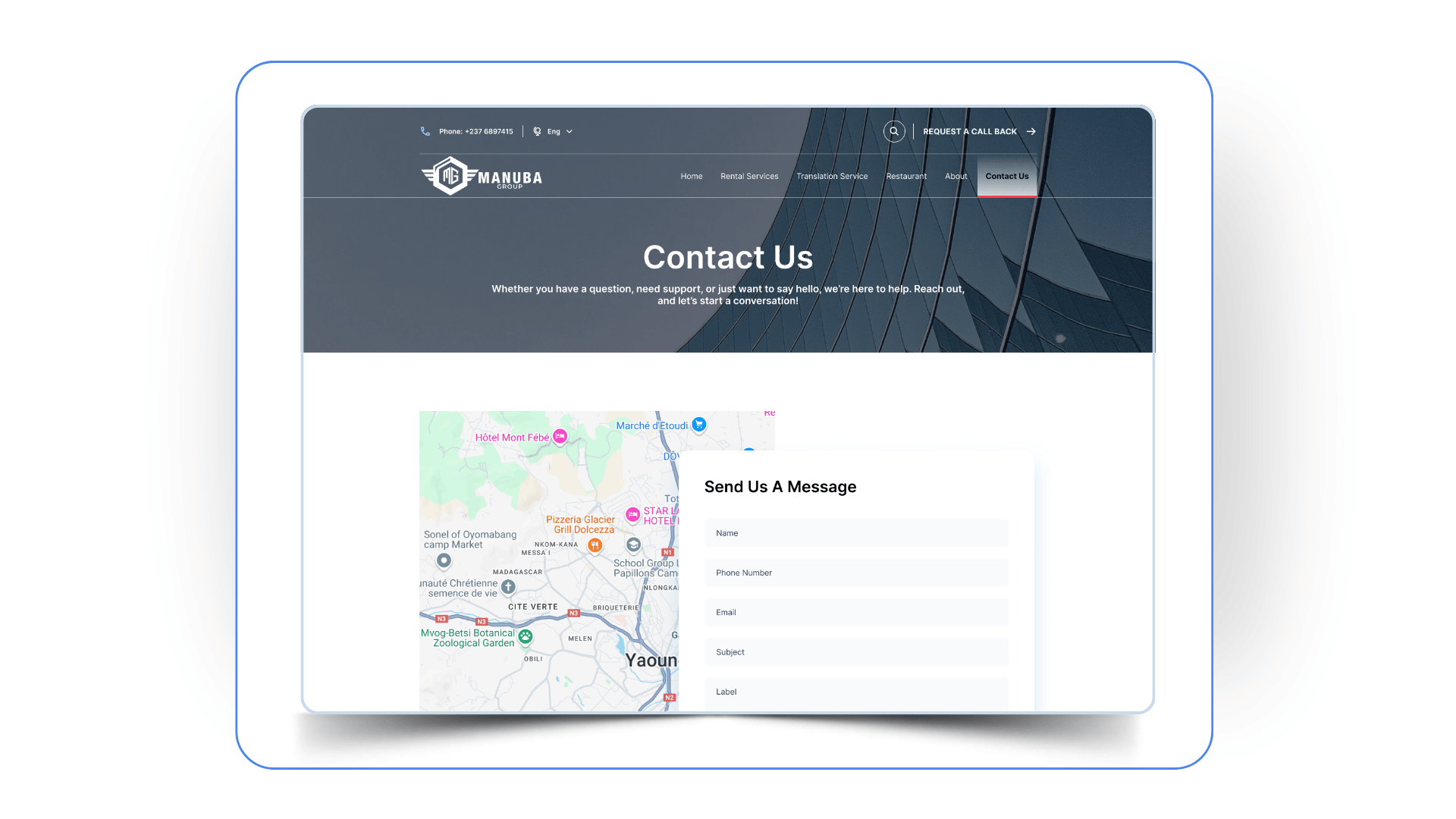
Floating WhatsApp button on all pages for instant orders or inquiries
Clear service sections on the homepage for quick navigation
Visual menu display for the restaurant
Simple translation inquiry form and language list
Rental booking cards with photos, descriptions, and prices in FCFA
Newsletter sign-up in the footer
Social media links
Visual Direction
Logo: The Manuba Group logo features a shield with the initials “MG” at the center and wings on each side, symbolizing strength, trust, and reliability. The shield conveys protection and prestige, while the wings represent speed, agility, and upliftment , reflecting the company’s dynamic services across hospitality, translation, and rentals. This design creates a bold, unified identity that positions Manuba Group as a trusted and versatile leader.
Colors: Core blue + red, with warm accent tones
Typography: Friendly sans-serif font for headers, clean sans-serif for body text
Imagery: Bright, authentic photos of food, team, events, and equipment
This project challenged me to create a unified experience for a company with diverse services. It was exciting to work on a design that is not only practical but also brings warmth, personality, and local flair to the digital space.